A great website needs effective content, beautiful design, and hassle-free maintenance. Component-based design, a hot topic in web development circles, helps you achieve all three.
In short, component-based design is the practice of splitting pages or screens into smaller, more manageable parts. Applications of component-based design are seen in Atomic Design and the emerging practice of Design Systems. These trends have a common goal: get designers thinking like developers.
Trending principles of modularity, reusability, and scalability in design have long been familiar to web developers. Component-based design naturally enforces the programming modularity principle of separation of concerns. That is, the division of applications into distinct modules with little overlapping responsibilities, or “concerns.” New programmers are taught early on about the importance of reusability with the D.R.Y. (Don’t Repeat Yourself) acronym, coined by Andrew Hunt and David Thomas in the book The Pragmatic Programmer (1999). Programmers are constantly thinking about the scalability of the software they are building with every decision they make, future-proofing it for any anticipated or unanticipated use.
These principles have come into vogue for designers. Evidenced by a growing body of literature and publicly documented design systems for big brands like GE, Spotify, Salesforce and Airbnb, a design system built up from this perspective can embrace a wide range of communication needs (including new and not-yet-identified needs), while working across multiple products and channels.
It’s every “component” for themselves
Facebook’s public launch of the React Javascript Framework in 2013 marked a paradigm shift in how websites are built. In fact, React’s meteoric rise in popularity among developers is largely due to its component-based architecture. “Thinking in React” means approaching web development in a modular way, where each component has a single concern. Today, websites like Airbnb, Netflix, and Reddit are all built using React components.
“Here’s the simple truth: You can’t innovate on products without first innovating the way you build them.”
Alex Schleifer, Airbnb
Component-based architectures make websites faster and easier to build. Site building tools like Wix and Squarespace have based their business model on this fact. WordPress and Drupal have updated their core software to follow this lead, reinventing their editing interfaces to allow site administrators to create content-rich pages from flexible components that can be rearranged or replaced by editors at will.
At Blue State, we recognize the benefits of these trends for creating sites that are both flexible and resilient (in fact, this very website uses Gutenberg, WordPress’ component framework). For everyone involved in a site redesign – including designers, writers, and business stakeholders – embracing component-based design means making a conceptual leap from a template-based approach to thinking like developers.
Ensuring reusability, while keeping the designs interesting
Our clients are often aware of these trends, and in many cases are asking for a modular approach for their next site design. However, we also hear anxieties around reusability in component-based design. Too much variety in components leads to a visually fragmented user experience and can be overwhelming for content editors. Too little and the design becomes repetitive and predictable. So how do we avoid creating a cookie-cutter website while also keeping our designs consistent?
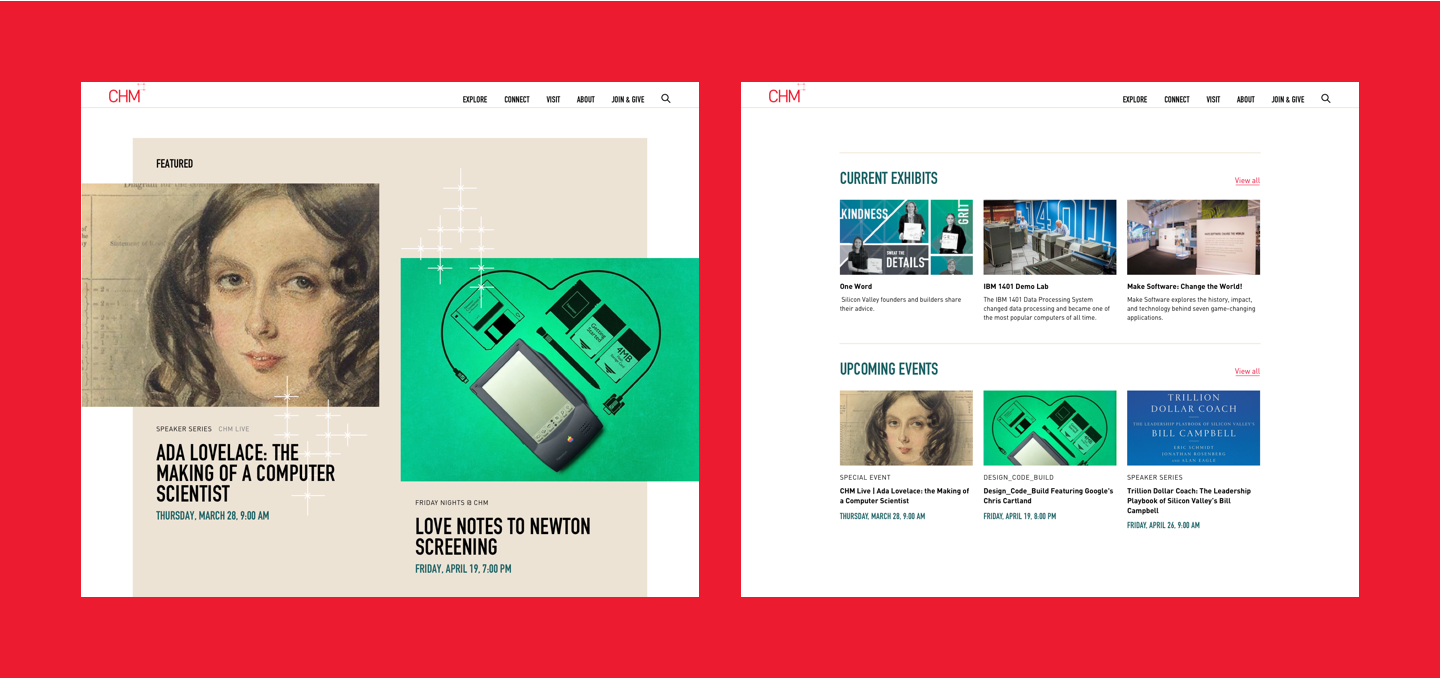
The first step is to choose the right mix of components. In our work with the Computer History Museum, we prioritized components based on how often they would be used, the value they add to the overall site experience, and their complexity. We’ve found that the key to a successful modular design is to strike a sophisticated balance between flashier elements that create interesting brand moments with highly versatile, utilitarian components that are intuitive to editors and ensure the site has a long shelf life.
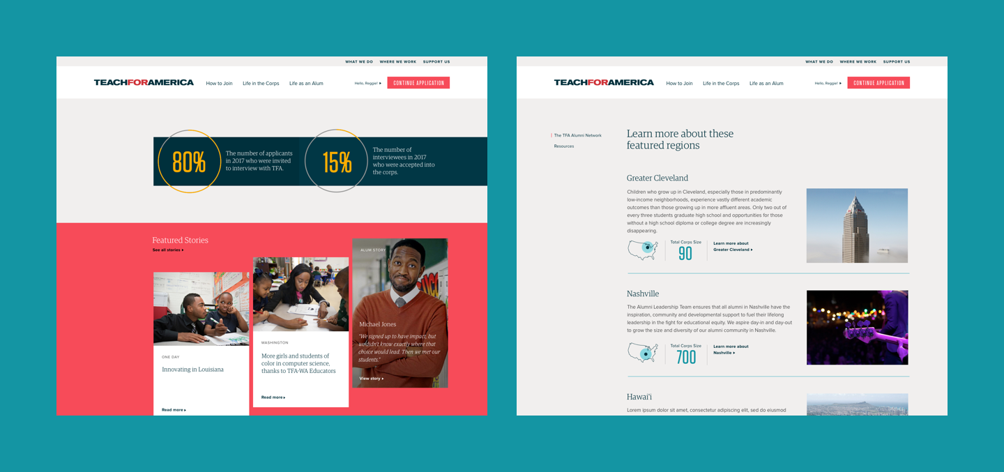
You wouldn’t make every light fixture in your house an ornate chandelier. Our favorite component-based sites have just enough of these flashier “chandelier” brand moments in certain components to create a distinctive feel but not get in the way of the work the site must perform. For example, the site we built for Teach For America (TFA), balances modules with strong visual impact, and those that recede and are more no-nonsense.
Second, create variants of existing components. Minor modifications like changing a background color or making some elements optional can make a given component feel drastically different when reused while maintaining consistency. It also comes at a low cost since developers are simply leveraging existing code to make those changes. Understanding when to invest in a new component instead of making a variant of an existing one requires designers who understand the development implications of their design ideas.
But with great components comes great responsibility
A modular approach grants content producers a great deal of power. Components can not only be rearranged, but also embedded within one another, quickly creating a large number of possible combinations. Unfortunately, this can easily lead to unintended and confusing visual results. When components are used improperly, this freedom can lead well-meaning marketing teams to create pages that defy the designers’ and developers’ original intentions – the dreaded “dog’s breakfast” page.
To avoid this, designers need to think in advance about the scalability of their design system to anticipate the myriad of ways components could be used. During our development process, designers are heavily involved in defining rules for how and when components can be used. Components are assigned to particular page types and restricted to certain places on a page. Defining these types of constraints, for the purposes of scalability, is something typically associated with developers. In the component-based future of web design and development, involving designers in the coding stage is increasingly necessary.
However, not all boundaries can be applied with code. With most component-enabled websites, Blue State provides clear, detailed guidelines packed with rules and principles of the design system to help govern the content creation process without stifling its creativity. This includes the dos and don’ts, as well as good examples of well-composed component web pages. For TFA, we documented everything with a dynamic style guide website that any developer or designer can pick up and work with.
It’s long been said that developers and designers operate at different wavelengths. Component-based web design is now bridging this gap, pulling designers much closer to how the final product is going to be built. With a developer mindset, the right mix of components and strong guidelines, designers are now creating resilient, brand-defining websites with an eye at the future.
If you’re looking for designers who think like coders and developers with a keen design eye, you’ve come to the right component-based website. Get in touch with us.