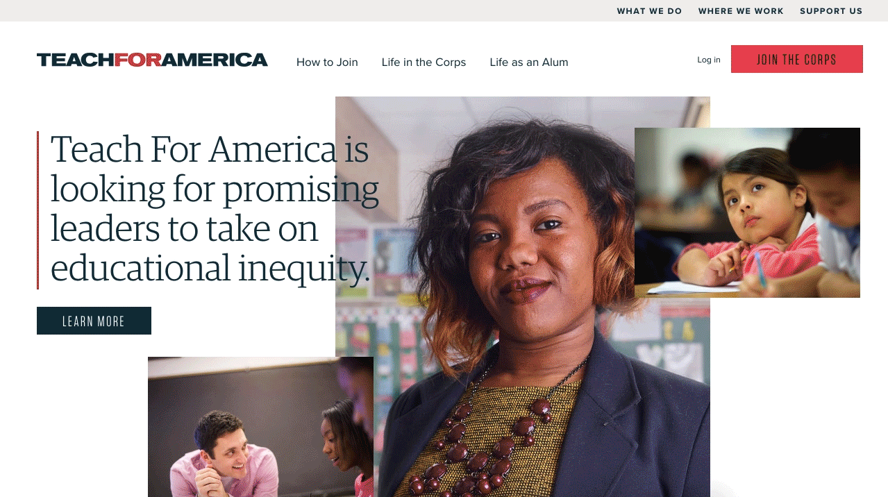
Teach for America
A better way to apply
The Challenge
Teach for America (TFA) applicants across 51 regions — each with their own story and opportunity — need to navigate the organization’s main site, a separate application site, and dozens of microsites. How can we make that experience as clear and consistent as possible?
The Insight
The user interface needs more than just a new coat of paint. By redesigning the application process and publishing tools, we can make life easier for both applicants and TFA’s administrators.
The Solution
Our flexible design system, standardized across regions, helps TFA speak with one voice to applicants and supporters across the country. A single sign-on application process makes it easier than ever to recruit the next generation of educators.
Teach For America (TFA) helps to address the enormous problem of educational inequity in the US.
TFA recruits and places teachers in 51 regions across dozens of states, each with unique certification requirements and staffing needs.
Their websites included a main public site, a logged-in platform for teaching corps applicants, and 53 microsites — each of which looked and functioned differently. Plus, the experience also has to cater to the needs of staff, alums, and donors.
Teach For America partnered with Blue State to personalize and simplify the process for prospective teachers and develop a consistent brand experience across the various aspects of its digital presence.
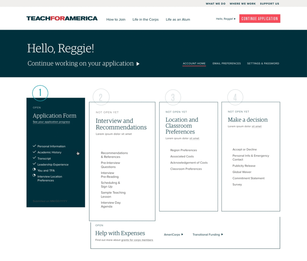
A simpler application experience
While assessing Teach For America’s technology infrastructure, we also looked at ways to streamline the steps of the application process itself. We worked with the Teach For America team to tweak the order of steps and consolidate activities where possible, then added clear visual indicators to help the applicant understand where they were in the process and what they were expected to do next.
Alongside our work with the application team, we also collaborated closely with the creative team at Teach For America. With a rebranding effort running parallel to the website redesign, we were able to influence design decisions being made across the organization — while also putting the new look and feel into practice with the public site and local chapter microsites.
A platform that meets the applicant where they are
While we needed to keep the application platform separate from the main site, we were able to create a seamless experience for users who had to switch frequently between the two. Since the application and vetting process can span several months, the new logged-in experience also features a detailed dashboard with status markers to help the applicant understand what they have completed and what still needs to be done.
Additionally, we added personalized modules that could be woven in throughout the pages of the public site to remind applicants of upcoming deadlines even when they left the application space — or to prompt new prospects to apply in the first place.
Next-generation tools that take advantage of Drupal 8
Working as a unified team with Teach For America’s developers, we created a beautiful new site that dramatically improves the user experience for applicants nationwide. We also helped Teach For America future-proof the website by migrating the complex enterprise system from Drupal 7 to Drupal 8, enabling in-house developers to iterate quickly on solutions in the future.