The word “accessibility” gets thrown around a lot and when people reference it, it can mean a variety of things.
It could mean that there needs to be improved language accessibility for users — such as releasing voter guide content in NYC’s top 10 spoken non-English languages (a challenge Blue State client NYCCFB recently found themselves in). It could also mean needing to follow a certain set of standards for people with disabilities in physical spaces. Or, it could be in reference to how we, as digital advertisers and designers, make our work accessible to those with visual or auditory disabilities.
Given how much ground “accessibility” covers, and how frequently that ground shifts in the digital space, it can honestly be a daunting area to wade into. But wade in we must!
The way our team looks at accessibility is that, regardless of any sort of temporary or permanent disability or circumstance, the digital experience should be comparable for everyone. The question is what we can do to enable that to happen.
Why accessibility matters
Let’s back up first and talk about why design accessibility specifically matters. To me, it boils down to four main points (although of course, there may be many more).
When we set out to educate and mobilize audiences, one of our primary goals is to cast a wide net and reach people who are marginalized or have not traditionally participated in that space. Imagine trying to get involved in a campaign or find information about a candidate if their website is unusable; you may think twice about volunteering or even voting for them. It’s really important that we’re meeting people where they need us to be.
Second — the amount of effort or attention that is put into making information accessible can be read as the amount of effort that an organization is putting into listening to these communities. Especially for a person running to hold public office, voters believe that ignoring these issues reflects directly on the candidate, and how much or how little they care about these groups of people.
Third — legally, accessibility standards must be followed for government work. Implementing this mindset and practice can be beneficial for someone running to be in government, or really any organization or brand.
Finally — a focus on accessibility truly makes design work better. We need to push back on the idea that accessibility limits design or content in any way. Design is a tool for visual communication. If there is a segment of our audience who cannot understand that form of communication, it’s simply bad communication. These guidelines and standards for designing content should be used as the bare minimum, and we must use creative inspiration to help make good work that people will actually be able to digest.
On the Warren for President campaign, our Design Director Raquel Breternitz helped champion accessibility for our team and our creative work. There were a number of basic practices we followed for every single piece of creative. Of course, most campaigns don’t have the resources of a presidential bid— and with quick timelines and rapidly changing circumstances, it can be tough to add one more thing to the list to worry about. However, there are still a number of simple techniques to improve design accessibility that all campaigns and organizations can and should be doing.
Choose colors with good contrast
When colors are combined and don’t have enough contrast, it can be challenging for people with vision impairment or colorblindness to read or even see type at all.
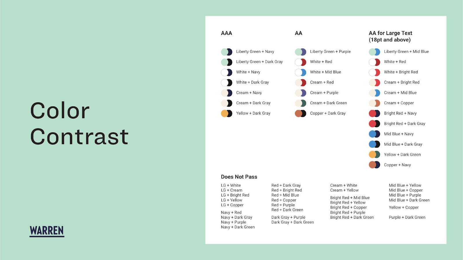
On the Warren campaign, we primarily utilized our navy with white and liberty green text to ensure all typography and graphic elements were super high contrast across digital and print materials. Below is a page from our brand guidelines document that shows our color contrast guides. We evaluated which colors passed WCAG AAA and AA standards, as well as the colors that did not pass any standards when used together.
When colors being used on websites or digital platforms don’t pass accessibility standards, they block out a large number of people who won’t be able to read your content.
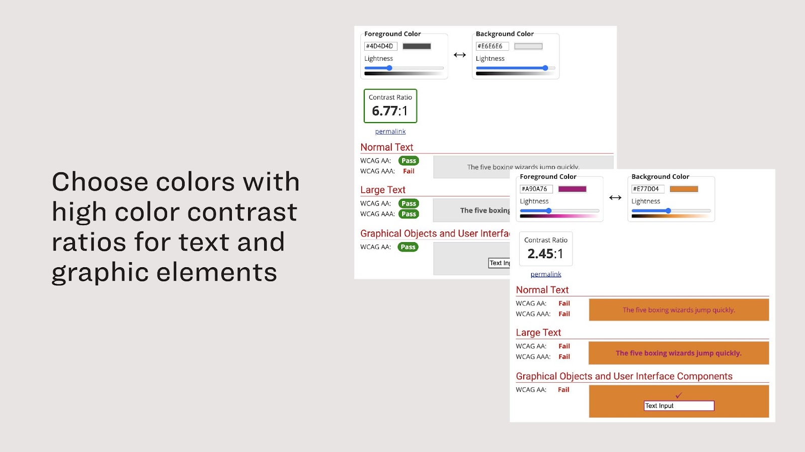
There are many resources online that can be used to measure color contrast, such as WebAIM (displayed below) or Adobe. By inputting two hex codes, the sites will output a ratio as well as a pass/fail score for each level of standards. If two colors are not reaching the standard being aimed for, it is simply a matter of darkening the darker color and/or lightening the lighter one. Alternatively, introducing a new color combination to lean on can be effective as well.
Does the font size make sense on the smallest screen?
This may seem like a no brainer — that the bigger the font size, the easier it is to read — but it can be challenging to achieve when considering all the different places digital work can be displayed.
Designing or reviewing creative digitally can also skew perceptions of how large or small text really is; software will often auto-scale designs to fill the screen they’re viewed on. This is why it’s essential to view designs on screens at 100%, the way people will view those same designs in the wild.
Considering how much of our audience consumes content solely on their phones, it’s extra important to evaluate what designs look like on mobile devices.
Get descriptive with link text so people know where they’re going
Below is a screenshot of the elizabethwarren.com website towards the end of the campaign. You can see the button on the top component that says “Watch Elizabeth Warren speak in Iowa” and the text link on the bottom component that says “Learn more about Elizabeth.” These are both pretty long links but they tell the user exactly what they’re clicking on.
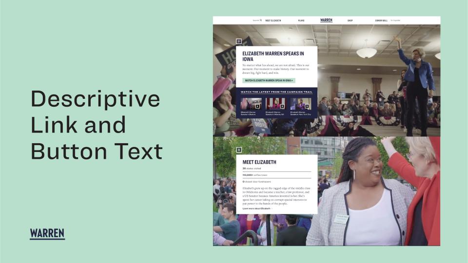
The tip here is to be descriptive with links. Instead of saying “click here” or “read more,” use language that’s much more descriptive about what happens when you click that link.
This will be really helpful for anyone who is using a screen reader — if they’re tabbing around the page, it actually separates button and link text out of context so all they’re hearing is a jumble of “click here” “click here” “learn more” and so on. But this is also just a better user experience, giving people cues and setting their expectations for what’s going to happen when they click.
Ensure you’re captioning video content
Below are three Warren videos posted on social media that you can see are clearly captioned with our brand fonts. And this is a great example of a couple of the tips that I’ve shared — the font is large, and there’s enough contrast with the white type on a black box or overlay. But also, the existence of the captions themselves is a huge benefit for accessibility.
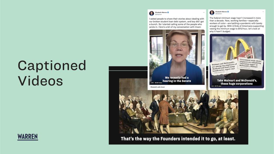
These days, I rarely see campaign videos that are not captioned and that’s great — because when I scroll through social media, my phone volume is always off. Obviously videos need to be captioned for people who are deaf and hard of hearing, but by not including captions you’re also alienating people who perhaps aren’t listening to audio for other reasons — for example, people who are maybe trying to watch in public with a lot of noise around them, or people who struggle to understand the language or dialect. If you’re producing videos, you’ve probably already spent a lot of time on them; it would be a shame to put something out there that clearly took effort and not be able to reach as many people as you were hoping to simply because it lacked captions.
Don’t forget to add alternative (alt) text on flat graphics
An image that’s shared on social media or on email or ads is always going to be flattened. It isn’t recognized by the platform that there even is text on it — for all intents and purposes, it is just a picture. That’s why it’s really important for all images to include context and descriptions.
Below you’ll see a recent quote graphic that we created for Warren Democrats. You can see on the right side the alt text that I grabbed from inspecting my web browser. If you don’t have alt text on a graphic, it might show up as “no image” or the file name.
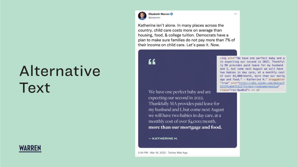
You should always include alt text for people who use screen readers, but also for those who have unreliable internet access that prohibits them from loading larger images. This is a simple extra step that allows more people to digest the content that you spent time making.
Accessibility is not a binary, it’s a goal
My colleague Alex Berger, Blue State’s Director of Technology & Product, has a good turn of phrase: He says accessibility is not a binary, but a goal. There is always more that can be done to reach that goal, but there isn’t a checklist that, once completed, ensures 100% accessibility for every single person.
Accessibility is a space that continues to evolve, and we’re continuing to learn and improve along with it.
We hope this overview helps get you started, if you haven’t yet developed your own accessibility standards, and of course, we’re here to help – don’t hesitate to contact us!
Also, if you have some learnings to share on accessibility, we’d love to hear from you.