First impressions are everything, and in a year where we increasingly rely on digital experiences, it’s important to give your community an accessible, effective, and engaging website journey.
The homepage acts as the “front door” to your organization and brand, introducing your identity, goals, and impact. Studies show that people form an opinion within a second of visiting your website that determines whether they’ll stay or leave. Our partners often ask: what’s the trick to hooking them in? There’s no “one size fits all” approach, but we’ve compiled a few tips to ensure you’re putting your best foot forward:
1. Accessibility is key
The most important thing we can stress is that your platform and homepage prioritize accessibility, mobile use, and bandwidth concerns — all of which overlap and compliment one another. Putting people first throughout your website design will ensure that you make choices to meet your audience where they are. Incorporating visuals that won’t bog down load time, using descriptive alternative text, and leveraging design elements that easily transition for mobile devices are just a few ways to make accessibility a priority.
2. Make your content count
When someone arrives on your site, it can be tempting to give them as much information as possible so they get to know you and your organization. But, you don’t want to overwhelm them.
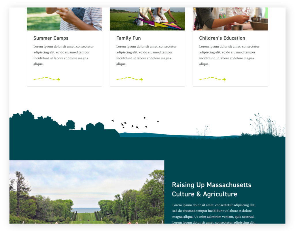
It’s important to prioritize your homepage content by audience goals and actions, but all too often it becomes a reflection of your organizational chart. In fact, homepages that are designed to provide space to every department will look unfocused and cluttered to users, dampening engagement.
It’s best to avoid too much content, particularly text content. Keep sentences and paragraphs short. You can also leverage infographics as shorthand for key points you want to convey, in place of text.
3. Express Yourself
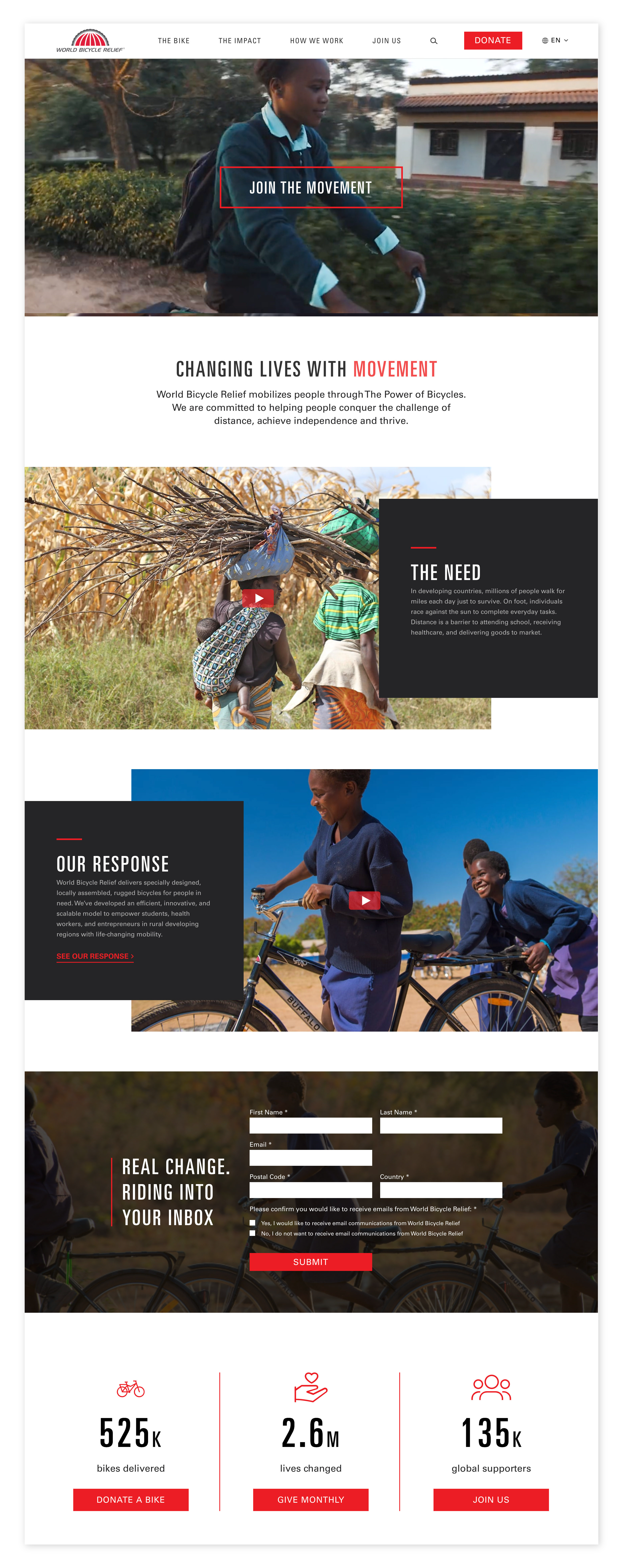
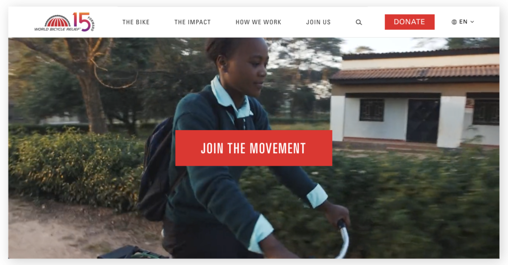
The homepage is the place to get creative with your brand expression. Lean into showing who you are in the most interesting way you can. Use concise imagery and clear symbolism over lengthy text to convey your organization’s mission.
4. Leave the carousels for the amusement parks
Carousels were all the rage years ago, and many organizations still have them — likely because they help you get more content above the fold, thereby satisfying the needs of internal teams. But while they do a nice job of consolidating content into one space, they provide an ineffective user experience. Statistics show that few people interact with these carousels and don’t wait to watch them auto-advance. They also negatively impact SEO scores.
5. Your CTA should be the VIP
Too many decisions and choices upfront will overwhelm your visitors. Attach an enticing call-to-action to different pieces of content. But don’t offer too many options or you risk diminishing the effect of other content and calls to action.
6. Be strategic about social
Social content should only live on your homepage for a strategic reason. If your channels are active and there’s compelling content to share, it’s OK to include them in curated, measured ways. But if they’re more stagnant, leave them out. Remember, users are more likely to engage with social content on social channels themselves!
7. Move it!
Microinteractions — like animations or interesting scroll behaviors — can enhance storytelling and add visual interest to your site. The homepage (and landing pages) are the places where the investment in development hours around these motion-triggered elements will arguably pay the biggest dividends.
Keep in mind that microinteractions should be implemented to be consistent with the site’s performance requirements, such as load speed and accessibility, and strategic goals like appropriateness for the content and target audiences.

8. Keep things interesting
We tend to avoid “layer caking” with the layout (stacking content components in alternating bands of colored backgrounds and white). Some visitors will tune out content that is formatted in the same, overused patterns (such as the three column cards with icons pattern).
As an alternative, we tend to favor ample vertical white space for division on pages versus hard lines and alternating background colors for panels.
Want to talk about how your organization is utilizing these best practices or other tactics you’re seeing in the space? Get in touch.