WomenHeart
A brand update with community at its heart
The Challenge
WomenHeart wanted to update their brand and website to better serve their community — and help them stand out from similar organizations.
The Insight
Women affected by heart disease want to understand their options for support service along the entire journey — from pre-diagnosis to recovery.
The Solution
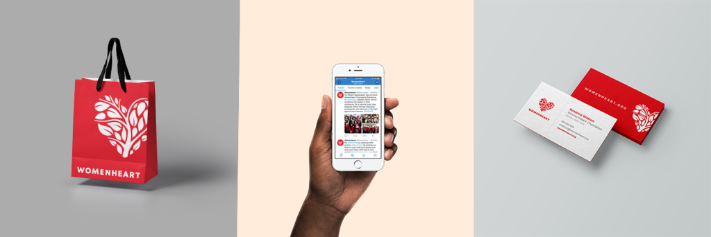
The new brand, down to the new logo, represents everything WomenHeart stands for: equality, support, acceptance, and the critical importance of holistic heart health.
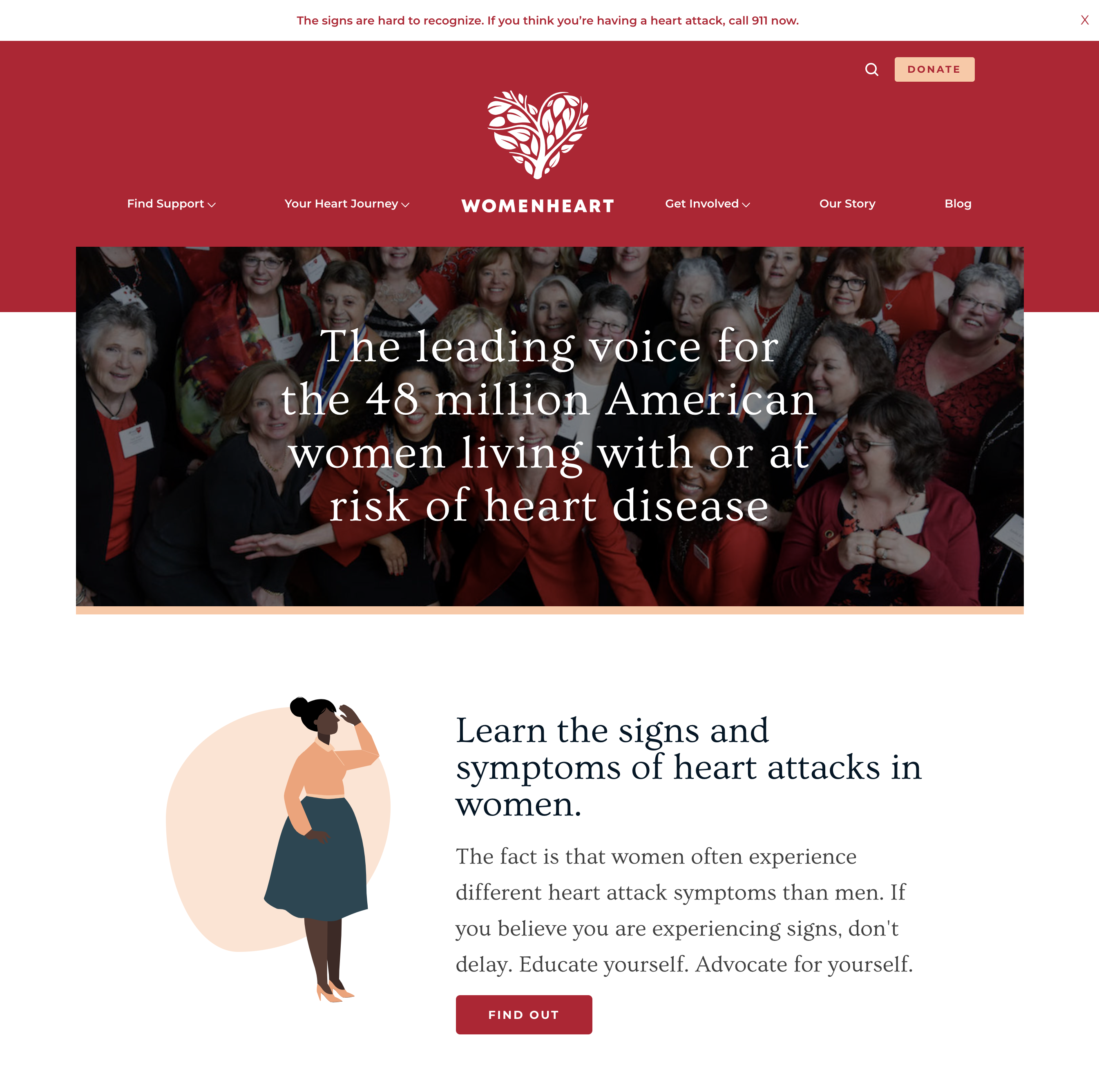
WomenHeart is a leading patient-centered heart health organization that provides resources and critical community support to women suffering from heart disease — and those at risk.
To commemorate their 20th anniversary, they wanted to update their brand and website to better serve their community and their organization.
Many nonprofits focus on heart disease; WomenHeart’s brand didn’t feel distinct from these other organizations. To help WomenHeart stand out in this crowded field, Blue State interviewed women affected by heart disease. We found that they want to be able to understand the entire journey, from pre-diagnosis to recovery, and to have more straightforward options for choosing support services.
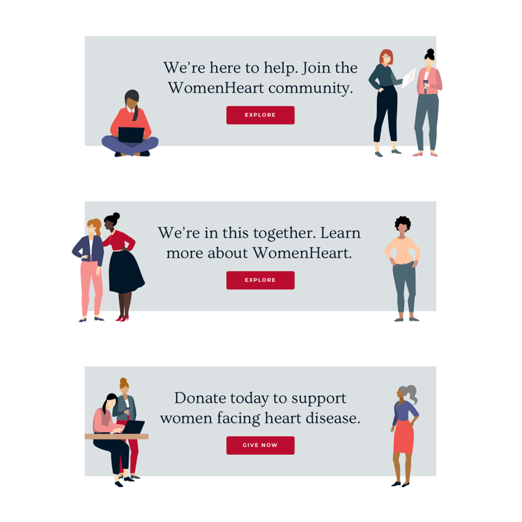
A site that speaks to all women at all stages
Through collaborative exercises, we developed a user experience that reflected a woman’s experience of heart disease. This journey — Prevent, Diagnose, Treat, Thrive — informed the structure of the site and makes it intuitive to browse and learn. To bring the journey to life, we developed a new logo and website featuring an illustrated style to help the site speak to all women — and not rely on impersonal stock imagery. Meanwhile, our content audit surfaced WomenHeart’s most popular pages to help them understand user engagement with the site — and cut underperforming content.
A rebrand that will thrive for years to come
The logo’s tree-like design evokes the organization’s community-centered spirit, while the positioning of the leaves mimics the physical structure of the human heart.
The new logo catalyzed an entirely new look and feel for the organization, extending to the smallest details. For example, the site features fonts exclusively from women typographers, reflecting the organization’s women-first mindset. We also created tone and voice guidelines and communication recommendations to help WomenHeart revitalize their newsletter and social media to match the redesign — and make sure their audience never misses a beat.