Design the visual language for a movement to compete in a competitive and high-stakes Democratic primary.
The Insight
Create a brand that supporters can take ownership of — when your audience feels empowered and encouraged to engage, there’s no limit to who your message can reach.
The Solution
As part of our broader charge to help shape the campaign, our teams crafted a visual brand that set the tone for the movement and reflected the unique strengths of the candidate.
Blue State’s founder, Joe Rospars, served as the Chief Strategist for Senator Warren throughout her presidential campaign, shaping campaign strategy and organizational development from day one. The approach involved helping the campaign build an unprecedented, integrated team in-house to mobilize supporters and reach voters. Blue State’s creative and technology teams worked hand-in-hand with the Warren crew in pushing forward the visual brand, the tech strategy, and to scale its fundraising and voter contact efforts across the country. Our work in developing the brand was truly a jumping-off point for the Warren team — they were able to take the system, embrace it, and push it even further.
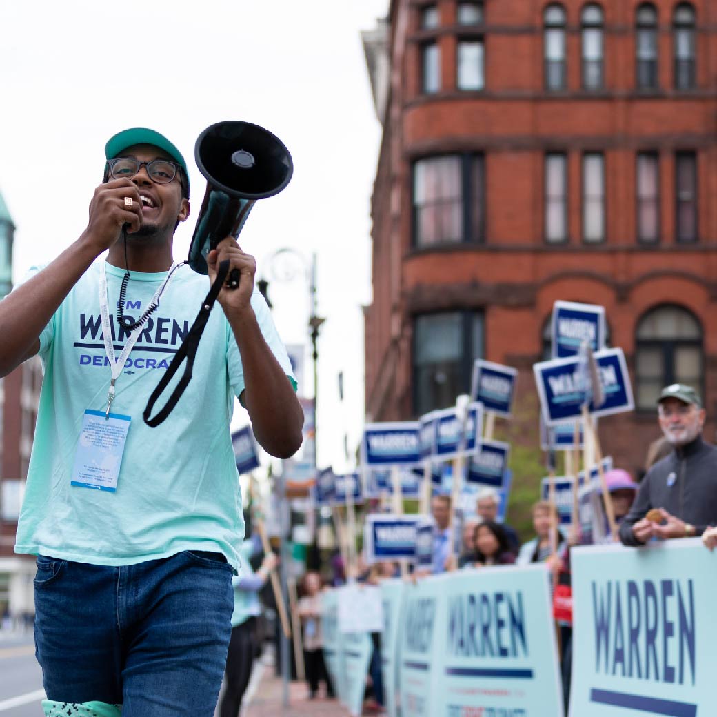
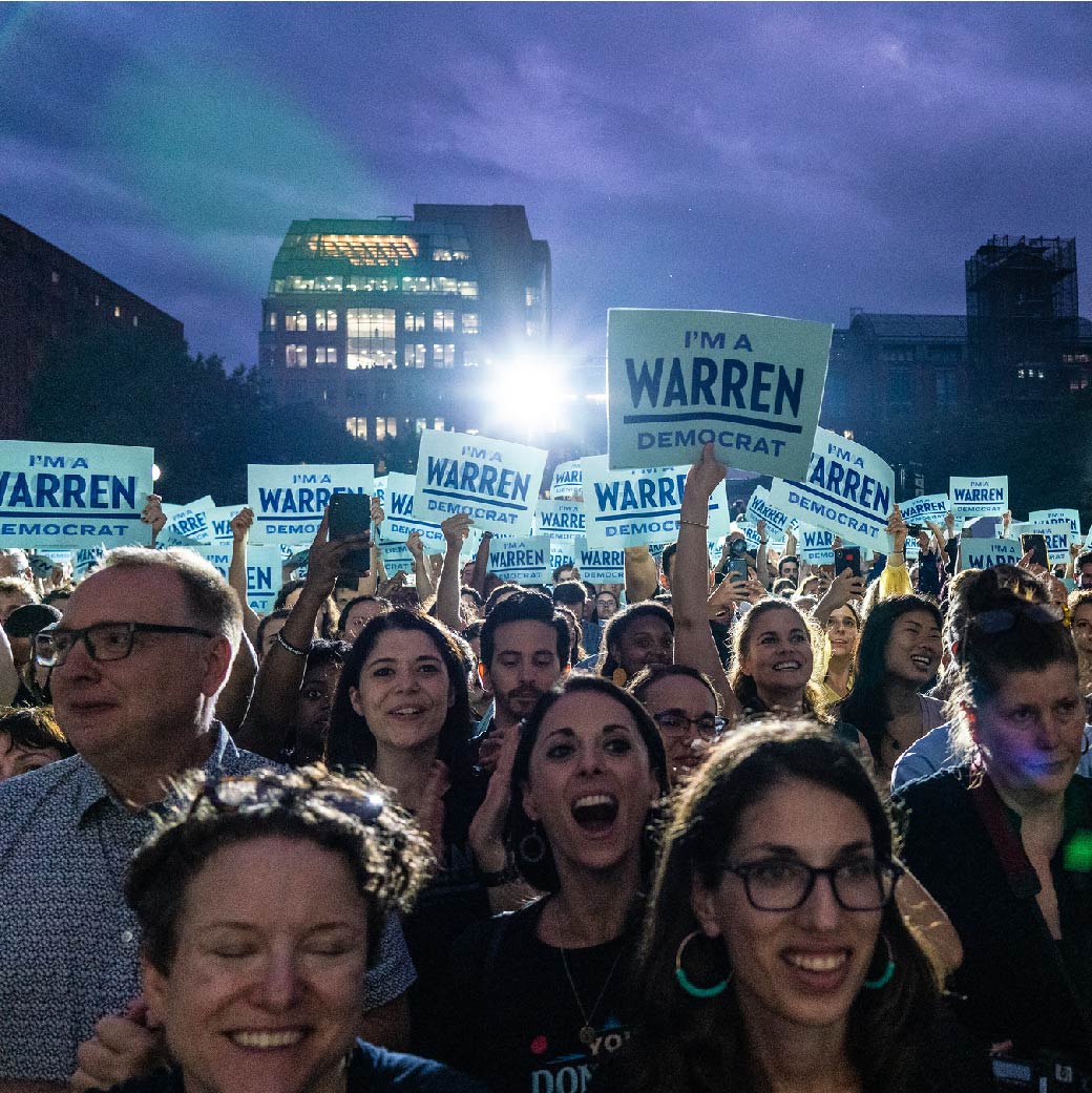
The Warren team customized personal experiences for volunteers and voters everywhere, and recruited one million grassroots donors faster than any first-time candidate in history. But before digging into the voter contact, fundraising, and strategy planning, the Blue State teams got to work on the first challenge — the logo and brand identity. That is the subject of this case study.
Using history as our guide
Developing a hopeful and engaging brand story in a moment of turmoil for our nation was our challenge. And, with the Democratic political field getting more crowded, Elizabeth Warren’s urgency and persistence to fight for what is right needed to stand center stage.
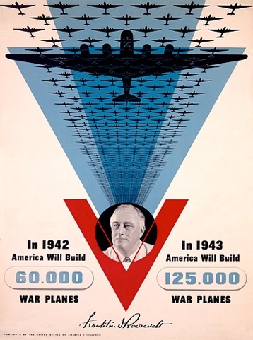
Our teams looked to the design and visual cues found in other historical moments and movements that called for big, structural change to inform Senator Warren’s brand story.
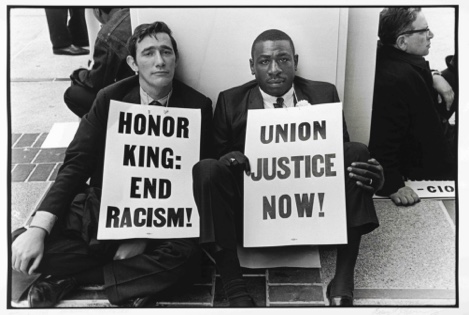
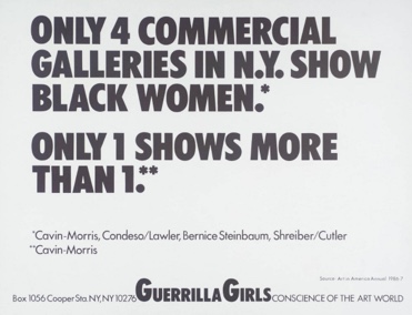
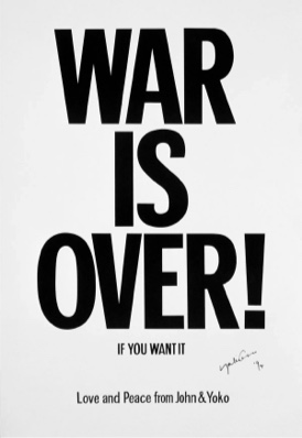
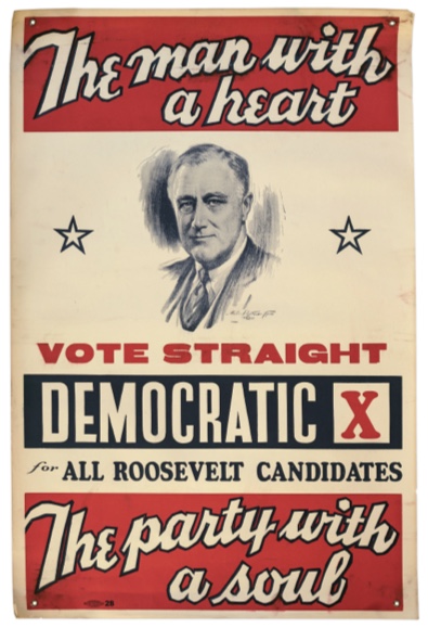
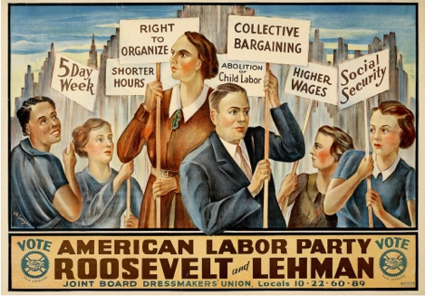
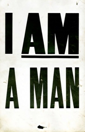
Inspiration comes from early WPA era signs carried for the 1932 general election, John and Yoko’s famous “War is Over” campaign, posters from 80s art activists “The Guerrilla Girls”, and the iconic “I Am A Man” posters held by hundreds of African Americans during the Memphis Sanitation strike.
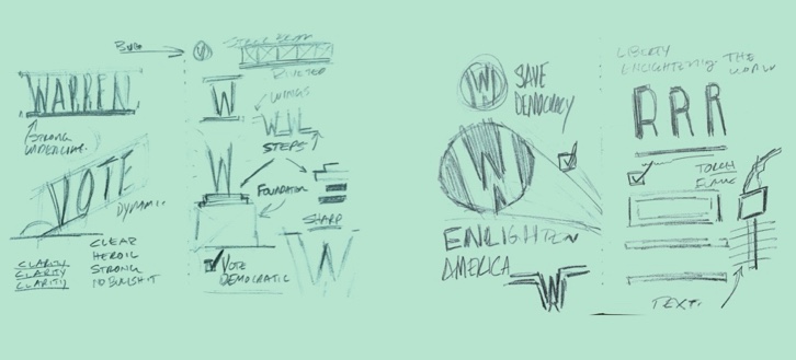
Initial inspiration sketches for the campaign’s typography.
From there, our team drew inspiration from iconic political movements of our recent past — leaning on the use of bold, condensed, uppercase typography and simple, clear statements of action.
The team agreed that the logo would most successfully manifest as a wordmark, with secondary, more simplified, and more graphic options to come later. We wanted the design to underline the clarity of the Warren message; not to have the message be an appendage to an icon based mark, no matter how well-designed. We also wanted the visual solution to help make “WARREN” synonymous with structural change and the bringing of truth.
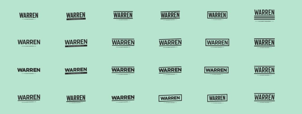
The team also worked alongside the crew at Hoefler & Co. who collaborated on refining the logo with us, and whose Ringside font was used throughout the campaign in supporter literature.
The compressed type was efficient (you could say a lot in a small space), easy to use (it could be stacked or treated quickly and easily), and highly visible and readable at a distance.
Collection of iterations of the Elizabeth Warren for President type marks.
But more than that, it helped to create an easy-to-use and forgiving design system that grassroots supporters could easily utilize on their own.
Expanding upon the expected
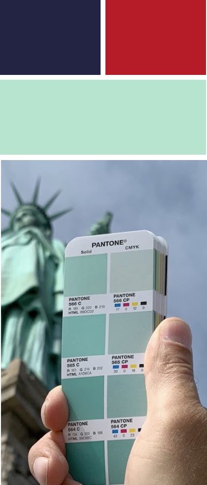
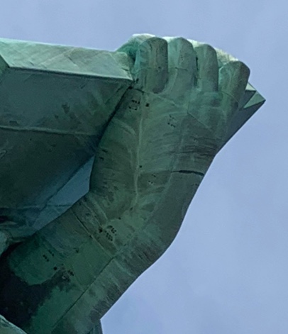
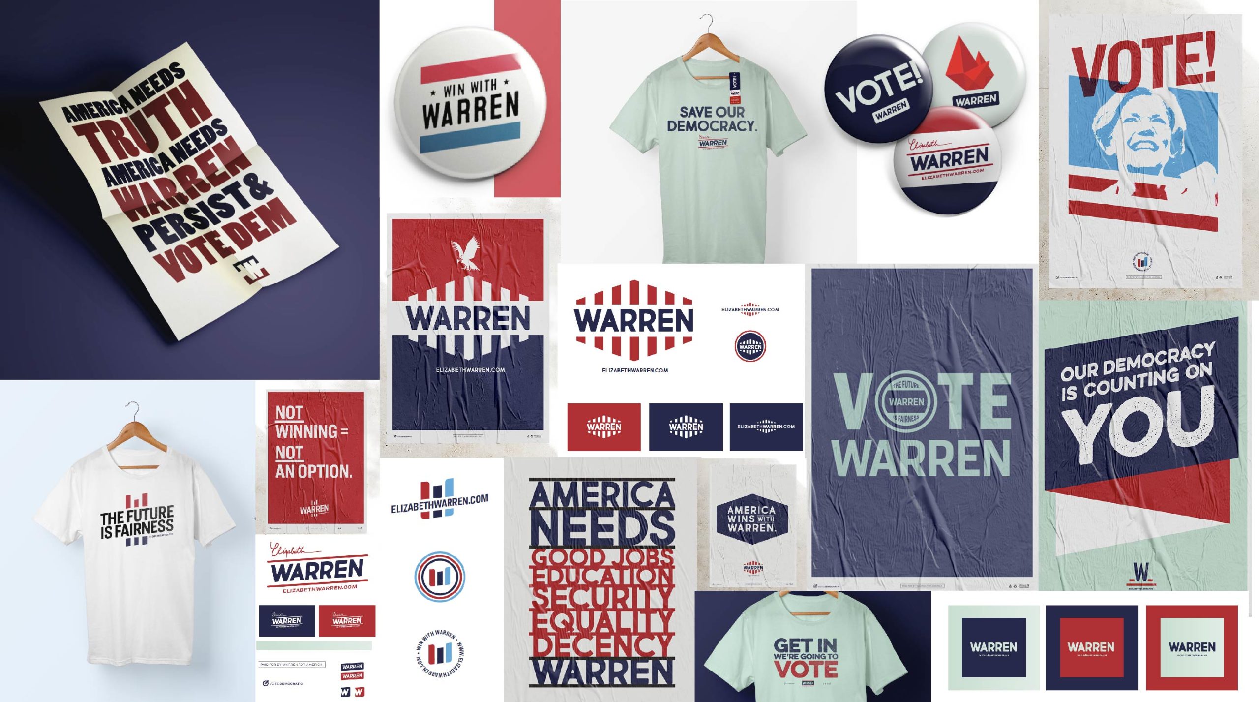
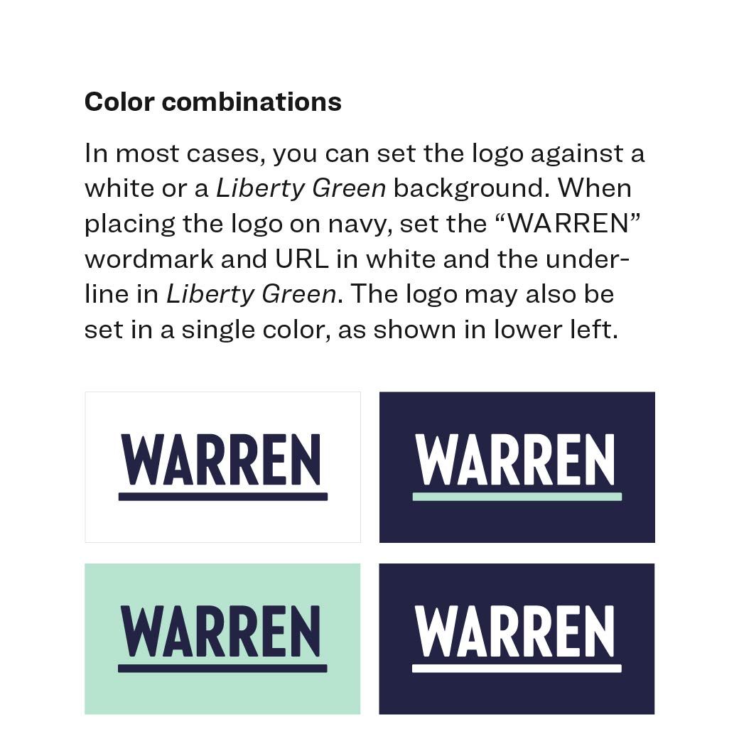
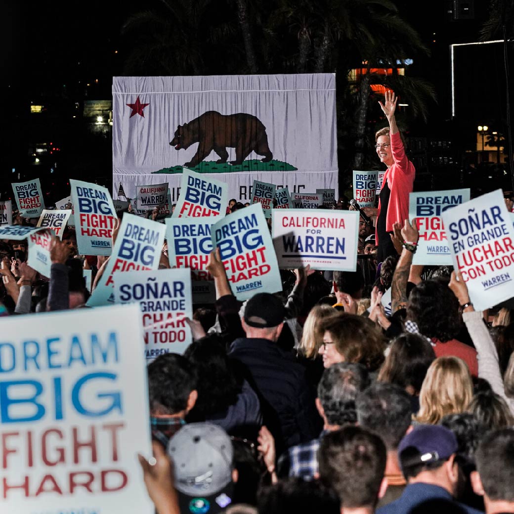
After laying the groundwork for where the brand was headed, the primary colorway was formed — incorporating what came to be known as Liberty Green.
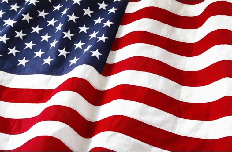
Matching and averaging dozens of color samples taken from the Statue of Liberty itself, this color acted as a highlight, and in some cases an entire field, to complement the strong reds, whites, and blues that did much of the heavy lifting across the campaign materials.
By choosing a color imbued with the ideals that America stands for, “Liberty Green” rooted the campaign in the principles of democracy, inclusion, and enlightenment.
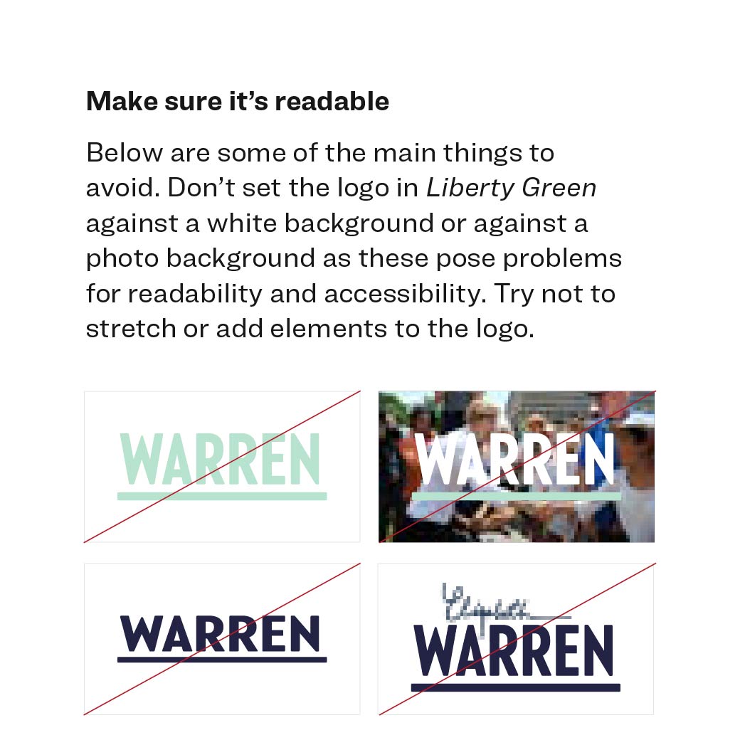
What’s more, accessibility was a top priority when developing our color palette. Many brands make the mistake of developing their color palette in a vacuum, with little to no thought about web accessibility. For this campaign, we chose a palette that would meet the minimum contrast requirements for readability — because being eye-catching is just as important as being accessible to all users.
Other campaign graphic details, like comic print halftones and ragged color washes, were inspired by the unstoppable optimism and moral clarity shown by our nation’s first comic book heroes like Wonder Woman and Superman. These choices rooted Elizabeth Warren’s brand in the fight for moral justice.
Initial iterations of the Warren for President brand and colors.
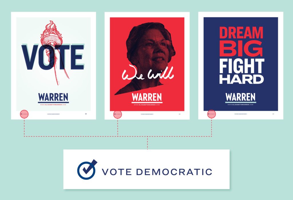
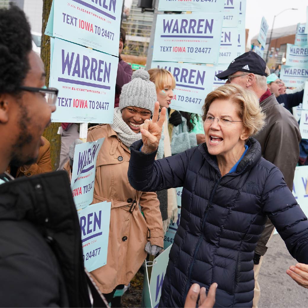
Taking a cue from the FDR posters mentioned in the design research above, every rally placard the campaign printed included this “Vote Democratic” mark. This message was equally important for the electorate to internalize, regardless of the primary’s outcome.
Passing the (Liberty Green) torch
It was clear from the start that this brand, this feeling, this movement — was meant for everyone. It belonged in the hands of Warren’s supporters and we planned to give it to them.
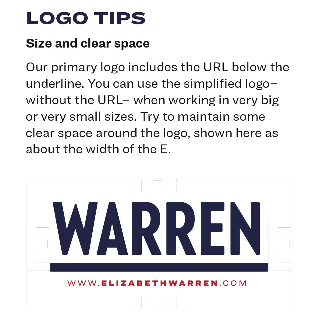
While intricate brand standards and guidelines were drafted for the internal design team, a single page version detailing general size, color, and readability guidelines was created and made available on the Warren for President website. To us, it didn’t really matter if the correct color green was used or if the spacing was exact, as long as it came from the heart.
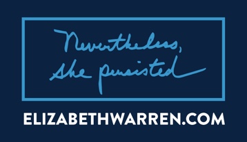
And it was that — the trust in the grassroots movement and the people who made it happen — that propelled the brand to become synonymous with a campaign that made those who were part of it fiercely proud and committed to one another. Despite the outcome, that experience of empowerment and the community that built up around this campaign will, nevertheless, persist.
Result
1mgrassroots donors, faster than any first-time Presidential candidate