Helping a global humanitarian organization be better equipped to fight poverty
The Challenge
Help CARE build a more unified platform to increase donor acquisition and deepen long-term relationships.
The Insight
The Solution
Create a modular design framework with a high-impact visual identity, making CMS management more intuitive and flexible for users and internal staff alike.
Our work with CARE began over the holiday season and wrapped up in the middle of a pandemic. We worked closely with CARE to adapt quickly to the changing landscape for both their work and their community of supporters.
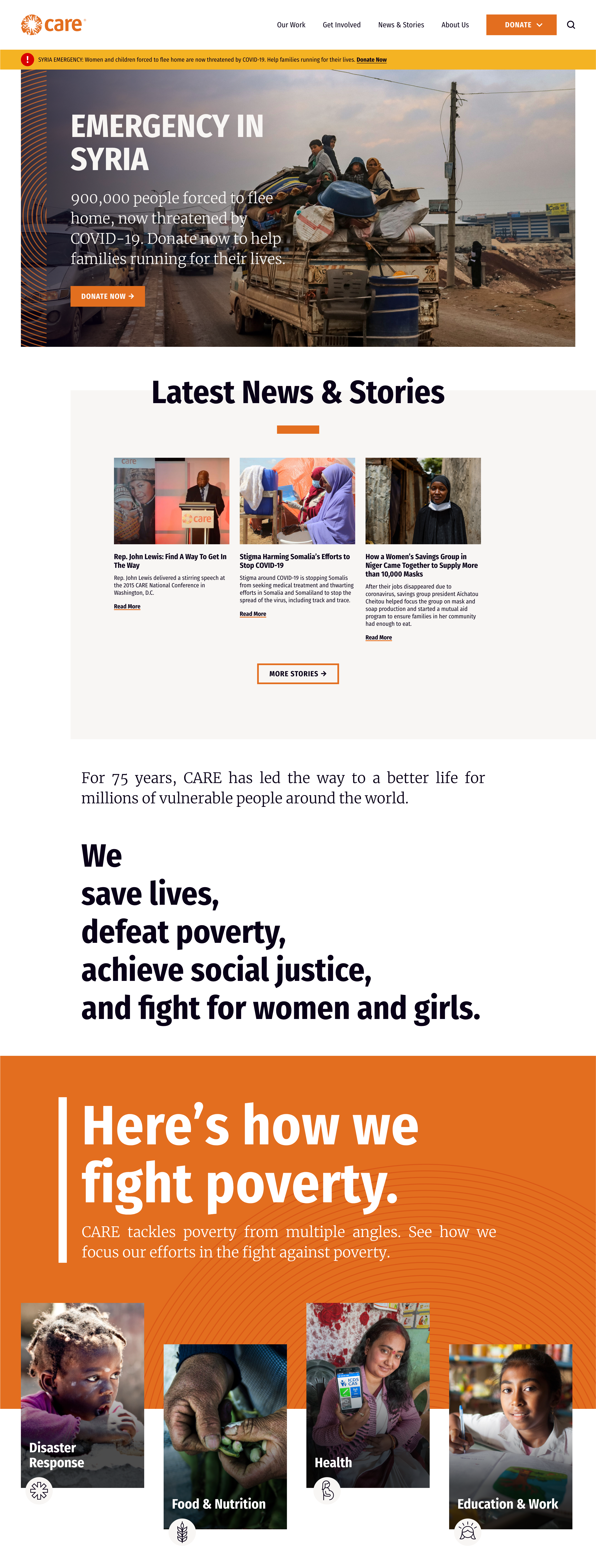
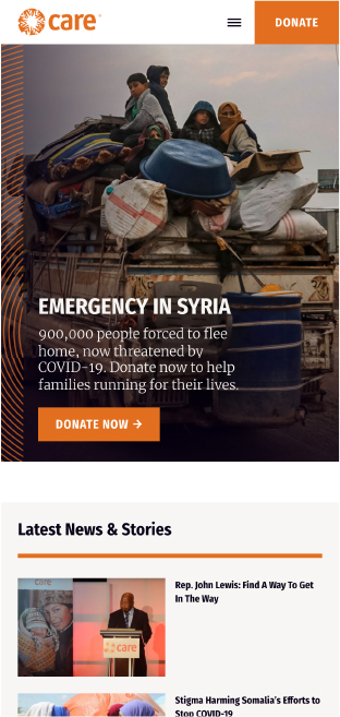
A little tender loving CARE
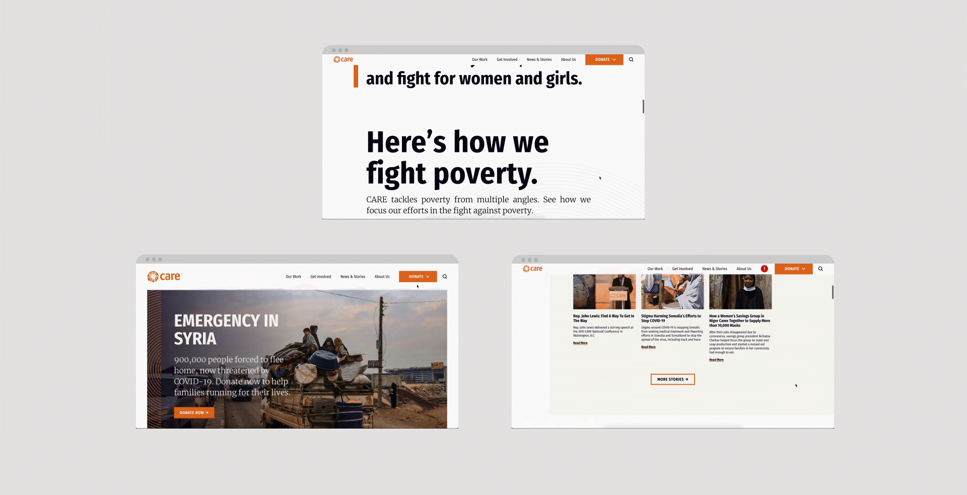
CARE’s previous site employed a template-based CMS developed in Drupal 7 and a set of newer satellite sites developed in WordPress. This platform had become difficult to maintain, and the presentation of content was not highly optimized for mobile. CARE needed a nimble, modular website system that could allow their internal teams to adapt and connect with their audiences across all devices. That’s where we came in:
By moving CARE’s separate microsites onto the same CMS, we were able to fold all of their information into one effective website — helping the organization take full advantage of the content they were producing. Our thesis was that consolidation would lead to better engagement and provide CARE’s audience a clear path to interact with their content.
And, in a moment when person-to-person contact is impossible and there are limited avenues to reach audiences, it was key to have a succinct hub for supporter engagement.
Prioritize cohesiveness + consistency
You can build a site with highly flexible backend content management capabilities, but if the design system lacks cohesiveness, then it will all be for nought.
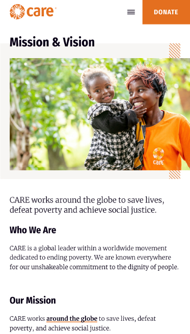
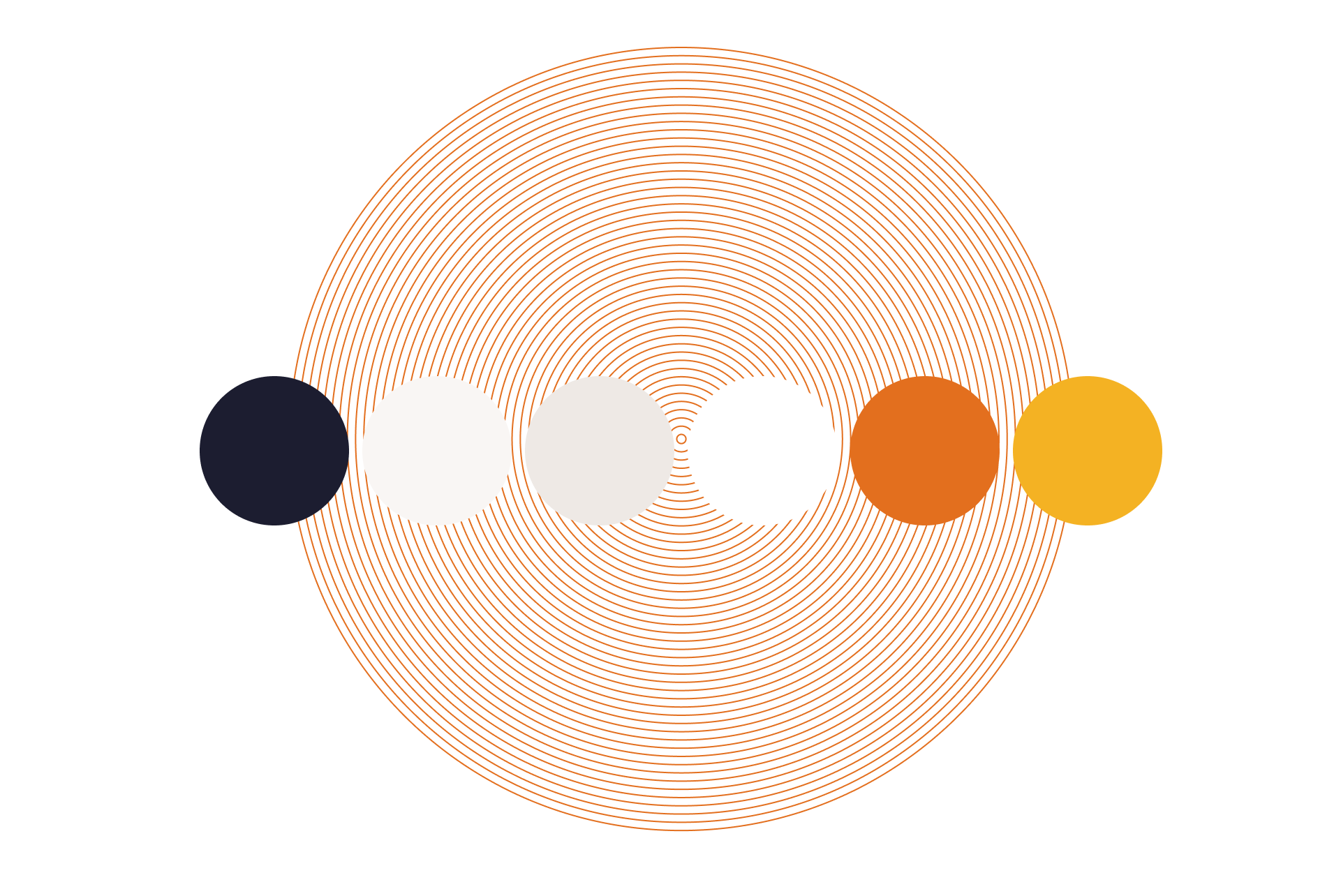
The previous CARE site overutilized certain elements of their brand, such as their signature orange. It needed a refresh that would not only bring the design system in line with newer graphic styles CARE was using, but also expand upon their existing creative.
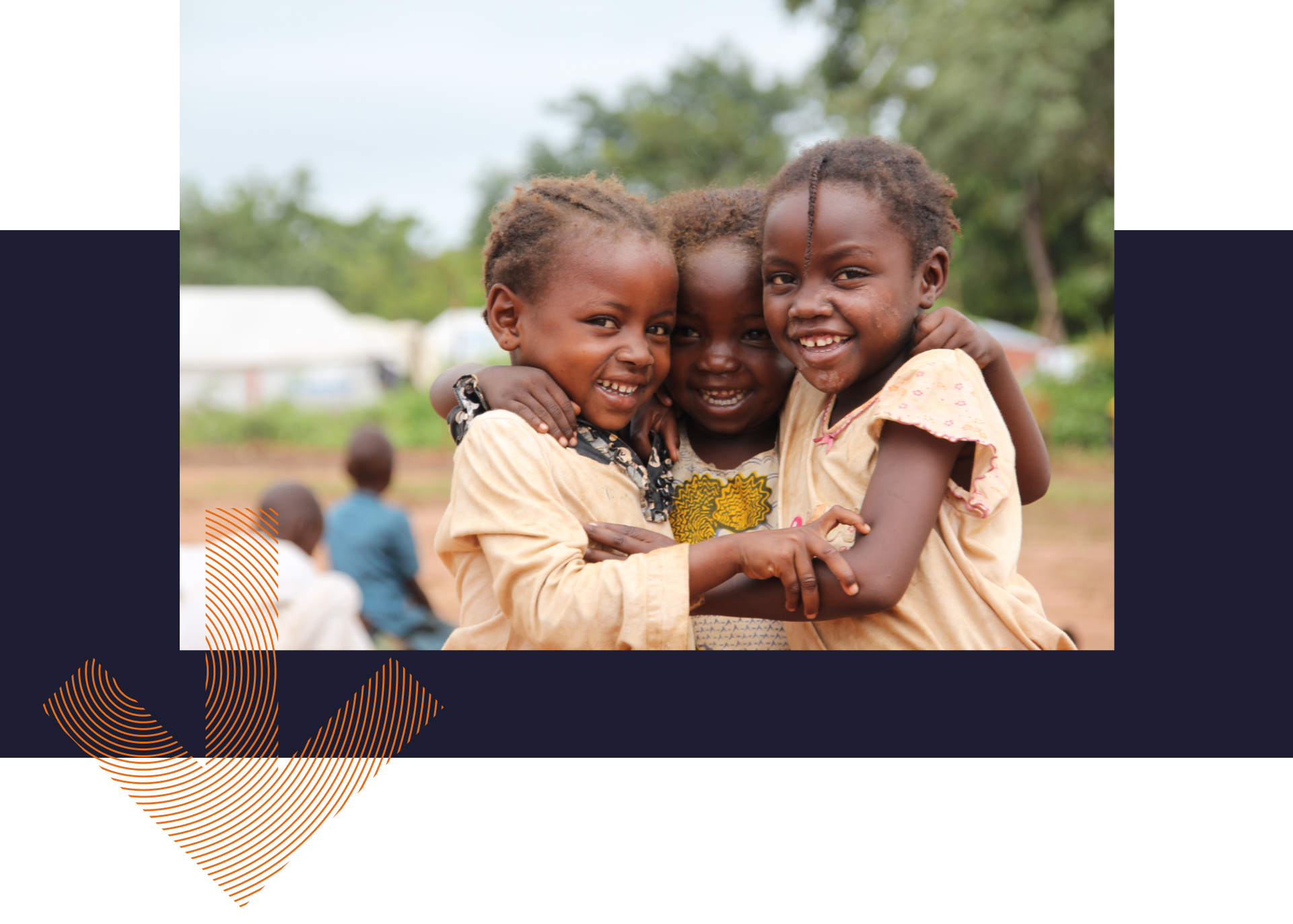
We introduced a navy color into CARE’s color palette for contrast and gravitas, and added geometric patterns throughout the site to give each page more structure and consistency.
The design for the site was so well received that these new elements were incorporated into CARE’s official branding materials.
Looking forward
We helped launch CARE’s new site in July 2020. Within a few weeks after the launch, CARE has already seen easier backend management with WordPress and an improved internal content process. We’re confident that CARE will only continue to build their supporter base and deepen relationships with this platform evolution.
Blue State’s excellent process, design and project management made the project feel easy – and I know it wasn’t. You guys are good! I’m grateful for all that your team gave to this project and am super excited about what the year ahead may bring. So glad to have you as a partner.”
Jessica Kirkwood | CARE USA | Executive Director, Supporter Engagement